


Apple uses words like "beautiful" and "delightful" when talking about Liquid Glass, but the truth is it’s none of those things. It’s messy, awkward, and while it may look brushed up and optimized in marketing materials the real-world results are anything but aesthetically pleasing. So, you may want to know how to adjust Liquid Glass in iOS 26.
iOS 26 transparency effects can sometimes interfere with readability, especially for anyone with certain visual needs. Thankfully the transparency problem does have a solution right now. You can turn it off completely, and the formerly transparent menus and icons automatically get opaque backgrounds.
How to make iOS 26 less transparent
The quickest way to make iOS 26 less transparent is through the Reduce Transparency setting:
- Open the Settings app on your iPhone.
- Select Accessibility.
- Tap Display & Text Size.
- Turn on the switch next to Reduce Transparency.
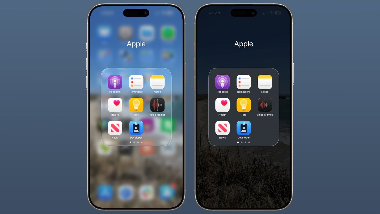
That’s pretty much it! You’ve successfully turned off Liquid Glass in iOS 26. Turning on Reduce Transparency setting adds darker backgrounds to translucent areas like Control Center, app icons, and app folders, so you should see increased contrast between elements throughout the system.
Note that Reduce Transparency only makes iOS 26 less transparent. It doesn’t completely eliminate all translucent elements or change button shapes — it simply makes translucent areas more opaque while maintaining the overall iOS 26 aesthetic.
Add Reduce Transparency to Control Center
For quick access to this setting, you can add it to your Accessibility Shortcuts to get to it from the Control Center interface:
- Tap through to Settings ➝ Accessibility.
- Scroll down and tap Accessibility Shortcut.
- Select Reduce Transparency in the list.
If you like, you can add the Accessibility Shortcut button to Control Center (long press a space between the interface’s buttons, then tap Add Control). After you’ve done that, you can quickly toggle the setting on and off directly from Control Center, making it easy to switch between the full Liquid Glass experience and a more opaque interface as needed.
Additional Contrast Options
If you’re still having legibility issues after enabling Reduce Transparency, return to Settings ➝ Accessibility ➝ Display & Text Size, then toggle on Increase Contrast. Note that enabling both Reduce Transparency and Increase Contrast will cause icons to lose most of their translucency.
Conclusion
One part of Liquid Glass I really disliked is all the translucency in the designs. When I open up a tab or a menu, I really don’t want to have to see the blurred remnants of the last thing I was looking at in the background.
Thankfully, i can turn off the iOS 26 transparency effect in the Accessibility settings, I would be stoked if Apple would let us do the same with the glowing effects. Because right now the whole system feels like a Temu-style version of Las Vegas. But since those effects were designed into the icons and artwork, rather than the OS itself, that prospect is probably just a pipe dream.


