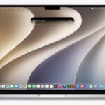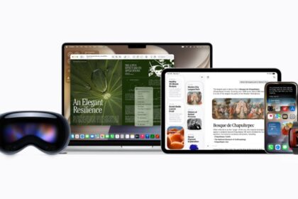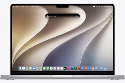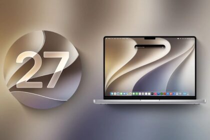



The most controversial change in macOS 26 Tahoe, was the new Liquid Glass interface, which greatly increased the use of transparency and glass-like distortion effects that added some glitz to the screen without increasing usability. In many cases, the new appearance made text harder to read, icons more difficult to decipher, and windows more cumbersome to use.
Over subsequent Tahoe releases, Apple made some adjustments to Tahoe to address a few of the most frequent Liquid Glass criticisms. But in macOS 27 Golden Gate, Apple has gone further still, tacitly acknowledging that Liquid Glass went too far the first time around while retaining the overall look and feel introduced in Tahoe.
If you hated Liquid Glass in Tahoe, you’ll probably find it less objectionable in macOS 27, but make no mistake: the user interface looks far more like that of Tahoe than that of Sequoia.
The Liquid Glass slider
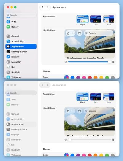
In the WWDC keynote introducing macOS 27 Golden Gate, Apple made a big deal about a new slider that ostensibly lets you decide how weak or strong the Liquid Glass transparency effects should be; it appears during installation and can also be adjusted at any time in System Settings > Appearance.
But, in fact, that’s not quite what it does. It merely changes the level of tinting for a handful of interface elements—particularly menus, Control Center, Notification Center, Spotlight, toolbars, and sidebars—that become a bit more or less transparent based on where the slider is set. Instead of having just two choices (Clear or Tinted), as in Tahoe, you can now select any point in the range between the two. But the effect is subtle, and the slider doesn’t change the transparency of the menu bar, Dock, Finder icons, or most other items.
If you want to get rid of most transparency altogether, you must still go to System Settings > Accessibility > Display and turn on “Reduce transparency.” That makes the menu bar, menus, sidebars, and toolbars opaque, while greatly reducing the transparency of the Dock and certain other elements. However, paradoxically, it also removes the shading from sidebars, making them less clearly separated from the rest of the window.
Sidebar improvements
In Tahoe, window sidebars were inset from the window edges, reducing the amount of usable window space. In macOS 27, sidebars once again reach the edge of the window. In addition, macOS 27 brings color back to certain sidebar icons, all of which were uniformly dark gray in Tahoe.
Window improvements
macOS 27 makes two overall changes to windows: showing the active window more prominently and adjusting the corner radius.
In Tahoe, it could be difficult to figure out which window on screen was active. macOS 27 adds cues to make that more evident: the sidebar’s color is darkened, and color icons appear only in the frontmost window.
Another small detail that irritated a lot of people was that Tahoe made window corners much rounder (supposedly to match the curvature of laptop screen corners), which—like the inset sidebars—reduced the amount of usable space in windows. But not all windows got this treatment, meaning some windows had much rounder corners than others, which looked awkward. In macOS 27, all window corners have the same amount of roundness.
Fewer menu icons
Tahoe added icons next to most menu commands, a change with no evident utility (and against Apple’s long-standing human interface guidelines) that made menus more cluttered and inconsistent in indentation. In macOS 27, those superfluous icons are gone, though icons that existed pre-Tahoe are still there.
Updated app icons
Tahoe enforced the rounded-rectangle (or “squircle”) shape for all app icons from Apple and apps downloaded from the App Store. (Apps distributed outside the App Store could optionally work around this requirement.) In addition, Apple’s icons adopted a new look and feel that, unfortunately, also made them less distinctive. The icons haven’t changed dramatically in macOS 27, but they have become crisper and slightly more saturated.
The same slider exists on iPhone and iPad, where it works the same way but changes less; that is covered in how to reduce Liquid Glass transparency in iOS 27.