





When it comes to branding, few companies have done it as well as Apple. The tech giant has become synonymous with sleek design, innovative technology, and a logo that is recognized around the world. But how did the Apple logo come to be? In this article, we’ll take a deep dive into the history of the iconic Apple logo, from its humble beginnings to its current iteration.
The First Apple Logo
It all started back in 1976 when Steve Jobs and Steve Wozniak founded Apple Computer. At the time, they needed a logo to represent their new company, and so they turned to a graphic designer named Ronald Wayne. Wayne came up with the first Apple logo, which featured a detailed drawing of Sir Isaac Newton sitting under an apple tree, with an apple about to fall on his head.
While the design was certainly clever, it wasn’t exactly practical for a company logo. For one thing, the drawing was incredibly detailed, which made it difficult to reproduce at small sizes. Additionally, the image was too complex to be easily recognizable from a distance. After just a few months, Jobs and Wozniak decided it was time to rebrand.
The Rainbow Apple Logo
In 1977, Apple hired a graphic designer named Rob Janoff to create a new logo. Janoff’s brief was simple: he needed to create a logo that was simple, memorable, and easily recognizable. The resulting design was the iconic rainbow Apple logo that many people still associate with the company today.
The rainbow logo was simple yet eye-catching, featuring an apple with a bite taken out of it, with each of the colors of the rainbow represented in horizontal stripes across the apple. According to Janoff, the bite out of the apple was added to make the logo more distinct and to prevent it from being mistaken for a cherry or another fruit.
At the time, the rainbow logo was a bold choice. It was unlike anything else on the market and helped to position Apple as a company that was innovative and creative. It also helped to establish Apple’s brand identity, which was centered around the idea of being different and challenging the status quo.
The logo was an immediate hit, and it became instantly recognizable around the world. It appeared on everything from Apple’s products to its marketing materials, and it helped to establish Apple as a major player in the tech industry.
The Monochrome Apple Logo
In the late 1990s, Apple underwent a major rebranding effort. At the time, the company was struggling financially, and it needed to modernize its image in order to stay relevant. As part of this effort, Apple decided to change its logo from the rainbow design to a more modern, monochrome version.
The new logo featured the same basic shape as the rainbow logo, but it was simplified and streamlined. The rainbow stripes were replaced with a single shade of gray, and the overall design was made flatter and more modern.
The new logo was an immediate success. It helped to modernize Apple’s brand and position the company as a leader in the tech industry. It also helped to establish Apple’s reputation for sleek, minimalistic design, which has become a hallmark of the brand.
The Current Apple Logo
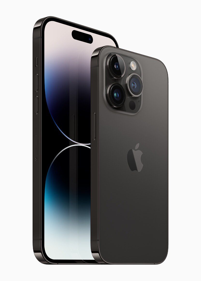
Today, the Apple logo is one of the most recognizable logos in the world. It has undergone a few minor tweaks over the years, but the basic design remains the same. The logo features a simple, monochrome apple with a bite taken out of it.
The current version of the logo is incredibly versatile and can be used in a wide range of contexts. It has been featured on everything from Apple’s products to its advertising materials, and it remains a symbol of the company’s commitment to innovation, design, and creativity.
Conclusion
The Apple logo has undergone quite a transformation over the years. From its humble beginnings as a detailed drawing of Sir Isaac Newton to its current iteration as a sleek, modern apple, the logo has played a vital role in establishing Apple’s brand identity and reputation.
Each iteration of the logo has been a reflection of Apple’s values and aspirations at the time. The rainbow logo represented Apple’s commitment to creativity and innovation, while the monochrome logo reflected the company’s desire to modernize and streamline its image.
Despite its many iterations, the Apple logo has remained instantly recognizable and has become a symbol of quality, design, and innovation. It has helped to establish Apple as one of the most iconic brands in the world, and it continues to play a vital role in the company’s identity and success.
But perhaps the most impressive thing about the Apple logo is its ability to adapt and evolve with the times. As Apple has grown and changed over the years, so too has the logo. And yet, despite its many transformations, it remains a timeless symbol of Apple’s commitment to excellence and innovation.
In a world where branding is more important than ever, the Apple logo stands as a shining example of what can be achieved with careful design, creativity, and an unwavering commitment to excellence. It is a testament to the power of branding, and it serves as a reminder that a great logo can be the key to establishing a successful brand identity.