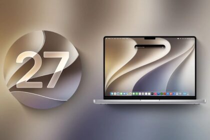





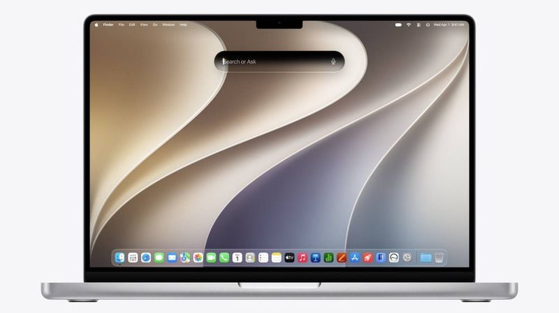
macOS 27 Golden Gate is one of those rare upgrades (like going from Leopard to Snow Leopard, for those who remember it) that focuses more on improving what’s already there than on new features. To be sure, there are new features, including a few big ones. But even those—I’m thinking of Siri AI in particular—are mostly revisions of existing features rather than entirely novel capabilities.
- 1. macOS 27 Golden Gate lets Sidecar take touch
- 2. The Liquid Glass slider
- 3. Sidebars reach the edge again
- 4. The active window is obvious
- 5. Fewer icons cluttering menus
- 6. App icons are crisper
- 7. iPhone Mirroring resizes freely
- 8. Control Center in iPhone Mirroring
- 9. Two-finger swipe to refresh
- 10. Finder columns size themselves
- 11. Freeform adds drawing and folders
- 12. Notes gets drawing tools
- 13. Notes copies as Markdown
- 14. Notes links to its sections
- 15. Passwords changes a password for you
- 16. A reset button on the Lock Screen
- 17. Shared albums reach Windows and Android
- 18. Home shows every camera
- 19. Podcasts can hide the video
- 20. Journal stamps the time
- 21. Mail strips list formatting
- 22. Calendar notes keep styled text
- 23. Find My works the same everywhere
- 24. Messages retries a failed send
- 25. New child safety features
- 26. Communication Safety blocks gore
- 27. Time allowances for apps
- 28. Shared iCloud links get access requests
- 29. Battery settings split in two
- 30. AutoFill from a third-party manager
- 31. Borders around controls
- 32. Hide your name on the Lock Screen
- 33. New keyboards and interface languages
- 34. Shortcuts gets new actions and storage
- 35. Spotlight’s four categories
- 36. A new macOS 27 menu bar icon
In the past, Apple has released detailed descriptions of all the new features of that year’s version of macOS. This year’s macOS webpage, by contrast, is extremely light on details, focusing only on what Apple considers the key features. The extensive feature lists circulating online are based on a single slide shown in its entirety for less than two seconds during the WWDC keynote, which listed hundreds of changes across all the version 27 releases.
I read every one of those items and tried as many as I could, but many did not seem to function as described. For some features it is not clear whether Apple removed them or the description was simply too vague to work out what should happen. Apple stresses performance and reliability improvements, which are harder to test, and in some cases I never noticed the problems they addressed in the first place.
What follows is the part of that list that owes nothing to Siri AI or Apple Intelligence. Of the five headline areas in Apple’s own summary, three are AI. These 36 are the rest, and several of them matter more day to day. For the release as a whole, including what the AI features do, see what’s new in macOS 27 Golden Gate.
Here are all the macOS Golden Gate non-AI features:
1. macOS 27 Golden Gate lets Sidecar take touch
In macOS 27, Apple has extended Sidecar in such a way that, for the most part, your finger acts as a proxy for your mouse pointer. You can tap any icon or other control, scroll with one finger, use menus normally, and so on.
This feature requires that your iPad also be running iPadOS 27.
Mac news and rumor sites claim this feature isn’t so much about having more control from your iPad, but rather part of the groundwork for a hypothetical future touch-screen Mac, which would presumably allow a similar form of interaction.
2. The Liquid Glass slider
The most controversial change in Apple’s version 26 operating systems, including Tahoe, was the new Liquid Glass interface, which greatly increased the use of transparency and glass-like distortion effects that added some glitz to the screen without increasing usability. In many cases, the new appearance made text harder to read, icons more difficult to decipher, and windows more cumbersome to use.
Over subsequent Tahoe releases, Apple made some adjustments to Tahoe to address a few of the most frequent Liquid Glass criticisms. But in macOS 27 Golden Gate, Apple has gone further still, tacitly acknowledging that Liquid Glass went too far the first time around while retaining the overall look and feel introduced in Tahoe.
If you hated Liquid Glass in Tahoe, you’ll probably find it less objectionable in macOS 27, but make no mistake: the user interface looks far more like that of Tahoe than that of Sequoia.
In the WWDC keynote introducing the version 27 operating systems, Apple made a big deal about a new slider that ostensibly lets you decide how weak or strong the Liquid Glass transparency effects should be; it appears during installation and can also be adjusted at any time in System Settings > Appearance.
But, in fact, that’s not quite what it does. It merely changes the level of tinting for a handful of interface elements—particularly menus, Control Center, Notification Center, Spotlight, toolbars, and sidebars—that become a bit more or less transparent based on where the slider is set. Instead of having just two choices (Clear or Tinted), as in Tahoe, you can now select any point in the range between the two. But the effect is subtle, and the slider doesn’t change the transparency of the menu bar, Dock, Finder icons, or most other items.
If you want to get rid of most transparency altogether, you must still go to System Settings > Accessibility > Display and turn on “Reduce transparency.” That makes the menu bar, menus, sidebars, and toolbars opaque, while greatly reducing the transparency of the Dock and certain other elements. However, paradoxically, it also removes the shading from sidebars, making them less clearly separated from the rest of the window.
3. Sidebars reach the edge again
In Tahoe, window sidebars were inset from the window edges, reducing the amount of usable window space. In macOS 27, sidebars once again reach the edge of the window.
In addition, macOS 27 brings color back to certain sidebar icons, all of which were uniformly dark gray in Tahoe.
4. The active window is obvious
macOS 27 makes two overall changes to windows: showing the active window more prominently and adjusting the corner radius.
In Tahoe, it could be difficult to figure out which window on screen was active. macOS 27 adds cues to make that more evident: the sidebar’s color is darkened, and color icons appear only in the frontmost window.
Another small detail that irritated a lot of people was that Tahoe made window corners much rounder (supposedly to match the curvature of laptop screen corners), which—like the inset sidebars—reduced the amount of usable space in windows. But not all windows got this treatment, meaning some windows had much rounder corners than others, which looked awkward. In Tahoe, all window corners have the same amount of roundness.
5. Fewer icons cluttering menus
Tahoe added icons next to most menu commands, a change with no evident utility (and against Apple’s long-standing human interface guidelines) that made menus more cluttered and inconsistent in indentation. In macOS 27, those superfluous icons are gone, though icons that existed pre-Tahoe are still there.
6. App icons are crisper
Tahoe enforced the rounded-rectangle (or “squircle”) shape for all app icons from Apple and apps downloaded from the App Store. (Apps distributed outside the App Store could optionally work around this requirement.) In addition, Apple’s icons adopted a new look and feel that, unfortunately, also made them less distinctive. The icons haven’t changed dramatically in macOS 27, but they have become crisper and slightly more saturated.
7. iPhone Mirroring resizes freely
Previously, the iPhone Mirroring app had only three sizes: Small, Actual Size, and Large. Now, you can resize it by any arbitrary amount, either by dragging a corner with your mouse or by using the zoom controls (View > Zoom In or Zoom Out, ⌘-+ and ⌘-– (minus), respectively).
8. Control Center in iPhone Mirroring
You can now, finally, access Control Center on your iPhone from iPhone Mirroring—choose View > Control Center or press ⌘-4. And you can even watch copy-protected videos (such as those from Apple TV) on your iPhone while using iPhone Mirroring.
9. Two-finger swipe to refresh
In any app that already has a refresh or reload mechanism (such as Mail and Safari), you can swipe down with two fingers on a laptop’s built-in trackpad, a Magic Trackpad, or a Magic Mouse to refresh the page, just as you would (with one finger) on an iPhone or iPad.
10. Finder columns size themselves
In column view, right-click or Control-click in any column, choose Show View Options, and check “Resize columns to fit filenames.” The columns autosize to the width of the longest names in each one. Uncheck that box to go back to regular sizing. You can also right-click or Control-click the double-bar button at the bottom of a column divider to show a menu with Right Size This Column, Right Size All Columns Individually, and Right Size All Columns Equally, where “right size” is Apple’s term for sizing determined by filename length.
11. Freeform adds drawing and folders
The Freeform app now supports drawing tools, just as many iPhone and iPad apps have done for years (click the Add Drawing button on the toolbar). You can also add folders to organize your boards (click the Folder button on the toolbar), and each folder can be shared with others (hover over the folder name, click the More button, and choose Share). When sharing boards or folders, Freeform may suggest recipients based on the contents of what you’re sharing. Freeform now supports Dark Mode as well.
12. Notes gets drawing tools
As in Freeform, drawing tools are available in Notes: click the Add Drawing button on the toolbar.
13. Notes copies as Markdown
You can use Edit > Copy as Markdown to copy styled text from a note with Markdown tags, ready to paste elsewhere.
14. Notes links to its sections
If you use section headings in your note, you can insert links elsewhere in your note that jump to them. Choose Edit > Add Link (⌘-K), choose the section heading from the Link to Section pop-up menu, and click OK.
Finally, you can now add horizontal divider lines in your notes by choosing Edit > Insert Divider Line (⌘-L).
15. Passwords changes a password for you
Passwords can already identify passwords that are too weak, or that have appeared in data breaches. Passwords like these that need changing are marked with a red exclamation point and feature a Change Password button that takes you to the appropriate page on the website. macOS 27 takes that concept further, where Passwords automates the process: it goes to the site, chooses a strong new password, saves your new password on the site, and stores the new password in Passwords—all with one click. But this works only on a limited number of sites that support the mechanism Apple requires.
16. A reset button on the Lock Screen
If “Show password hints” is turned on and you begin typing your password on the Lock Screen, a small question mark button appears to its right. Click that, and a message appears along with a Reset Password button, which you can click if you need to reset your password.
17. Shared albums reach Windows and Android
When you share an album via iCloud, other participants can now see and interact with it even on Windows PCs and Android phones. In addition, you can “upgrade” your shared albums to show photos and videos at full resolution and enable several other features. To do so, right-click or Control-click an album in the sidebar and choose Upgrade Shared Album; this walks you through a series of steps, after which Photos spends a considerable amount of time—perhaps hours—thinking.
18. Home shows every camera
The Home app now offers a single interface in which you can see multiple cameras and search for events, as well as 4K camera recordings.
19. Podcasts can hide the video
When you’re watching a video podcast in Podcasts, there’s now a Hide Video button beneath the progress bar that does just that (while keeping the audio going); bring back the video by clicking Show Video.
20. Journal stamps the time
The Journal app now automatically adds a time stamp to new journal entries, rather than just a date. It also raises the attachment limit (though Apple doesn’t say by how much).
21. Mail strips list formatting
If you have a bulleted or numbered list in a message you’re composing, you can now choose Remove List Formatting from the Format > Lists submenu or from the Lists pop-up menu to revert the list to regular text.
22. Calendar notes keep styled text
Calendar now supports styled text in notes, which some calendar apps (such as Google Calendar) support. That is, if you’ve used styling such as bold or italics on a note you created somewhere else, that styling appears in Calendar, too.
23. Find My works the same everywhere
Find My on all three platforms is now a single operation: click (or tap) a person, device, or item in the sidebar to reveal basic information about the location (like Nearby or their distance, street, and city), along with contextually relevant buttons right below it. To get more information, you click (or tap) the More button for full details, including all the other information previously found on the Info popover.
There’s also a top-level Me tab, giving you more direct access to your own information, something already present for years in Find My for iPhone and iPad.
24. Messages retries a failed send
Messages has improved searching. For example, if you enter a contact’s nickname or a portion of their phone number, the search lists both names and conversations that match, not just individual messages containing that exact text. Searching for media is also reportedly better, though I have so far been unable to produce any good examples.
25. New child safety features
For years, families have been able to use the Ask to Buy feature, in which children must have an adult’s explicit approval to purchase apps from the App Store. In macOS 27, this concept expands to include websites. If you enable Ask to Browse for a child, each visit to a website that’s not already approved pops up an Ask to Browse message on the child’s device. If the child requests permission, the parent(s) see a request in Messages showing the website in question, along with Approve and Decline buttons.
Ask to Browse works in Safari and other WebKit browsers, but not in Firefox or Chromium-based browsers, which means that any child who can figure out how to download an alternative browser can bypass this feature with trivial ease.
26. Communication Safety blocks gore
Communication Safety is an existing feature that, if enabled, warns children before displaying nude images in apps such as FaceTime and Messages, whether those images are incoming or outgoing. macOS 27 expands this to block violent or gory images, giving the child a way to end the conversation without seeing the objectionable material.
27. Time allowances for apps
Parents now have detailed controls available for restricting when, and for how long, children can use certain types of apps (including games and social media apps). You can, for example, restrict your child to playing games for just an hour a day, or set up a schedule with fine-grained controls, such as “you can use apps A, B, and C before or after school, but only D or E while at school, and F and G only in the evenings.”
28. Shared iCloud links get access requests
If you right-click or Control-click a file or folder in iCloud Drive and choose Share, then choose Share a Link from the pop-up menu, you now see a couple of changes in the interface:
If you click the text under that menu (“People you choose can view/edit”), the display expands as usual to show who can access the item and with what permissions. But there’s a new “Allow access requests” checkbox here. If you select that, then send a link to a group (as opposed to a single person), each recipient must explicitly request permission to access it, and you must approve that request. Only then is that person added to the Participants list.
A new Copy Link command appears on the Share menu. If you choose that, a dialog appears, with two options: click Continue to share in the normal way (keeping in mind the extra step described above if you share it with a group), or click Allow Anyone with the Link to copy the shareable link to your clipboard with no constraints on who can use it.
29. Battery settings split in two
Where Tahoe had a Low Power Mode pop-up menu with options Only on Battery, Only on Power Adapter, Never, or Always, macOS 27 instead has two pop-up menus, one for “On battery” and the other for “On power adapter.” For each one, you can choose Automatic, Low Power, or High Power.
30. AutoFill from a third-party manager
In the AutoFill & Passwords category, there’s a new “AutoFill from” switch, with entries indicating which app(s) can be used to supply AutoFill data. By default, Passwords is the only option (turned on by default), but if you have one or more third-party password managers, they may also appear here.
31. Borders around controls
Display: There’s a new “Show borders” switch, which adds borders around toolbar controls, Search fields, and various other interface items to more clearly distinguish their boundaries; this replaces and significantly improves on the previous setting “Show toolbar button shapes.”
Subtitles and Captioning: This category, which replaces Captions, adds three new controls to fine-tune when and where subtitles/captions appear: “Show when muted,” “Show on skip back,” and “Apply across apps.”
32. Hide your name on the Lock Screen
A new “Show user name and photo” switch is on by default, giving you the same behavior seen in Tahoe and earlier. But if you turn it off, usernames and photos no longer appear when your Mac is locked, which might be better for privacy in settings where a Mac may be visible to the public.
33. New keyboards and interface languages
Keyboards are now available for Afrikaans, Basque, Baybayin, Blackfoot, Comanche, Cree, English (Philippines), Galician, Guarani, Kiowa, Luxembourgish, Tsuu’tina, Xhosa, and Zulu.
You can now set the interface language for macOS itself to English (Canada)—woo hoo!—and English (Philippines) in System Settings > General > Language & Region > Preferred Languages.
34. Shortcuts gets new actions and storage
Shortcuts features several new systemwide actions:
Notification: This action runs when you receive a notification from a specified app.
Screenshot: This action runs when you save a screenshot to Photos, Files, and/or your Clipboard.
Store Content, Get Stored Content, and Delete Stored Content: You can now store data within Shortcuts itself, rather than having to create and manage external files.
35. Spotlight’s four categories
Here are the four Spotlight categories:
Apps (⌘-1): In this view, only apps are shown (regardless of where they’re located on your Mac). Recently used apps appear at the top, until you start typing.
Files (⌘-2): Similarly, in this view, only files and folders appear, but that includes apps, too! Again, recent files appear at the top (below Suggestions, explained in a moment) until you start typing.
36. A new macOS 27 menu bar icon
When you connect an Ethernet cable to your Mac (which, for laptops, requires an adapter), the Wi-Fi icon on the menu bar changes to an Ethernet icon; clicking this displays information about your Ethernet connection.